If you operate in a digital environment, at some point you must have come across the terms UX/UI Design. They refer to the design of an application or a website and they are often misinterpreted.We will not dig deeper into their differences. However, it is important to clarify, as an introduction, that the UX (User Experience) has to do with the operation and structure itself, while the UI (User Interface) is about the looks, the surface.
We will definitely analyze the UX more in the future. For the time being, we will focus on UI, after a seminar a member of our team has attended! Training is a part of our everyday life at TopHost and of course, we do not keep those benefits to ourselves, rather than share them!
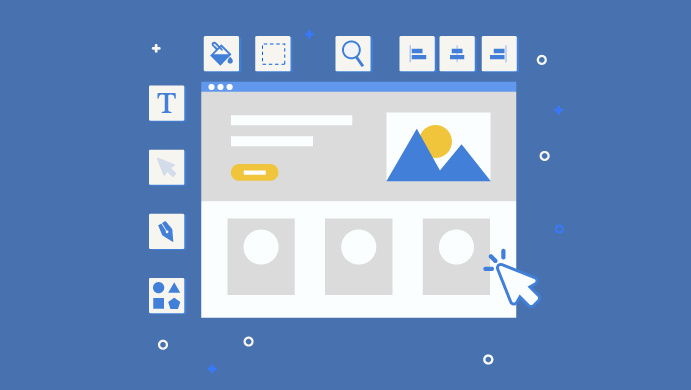
So in this seminar, we have “located” the 10 Usability Heuristics for UI design by Jakob Nielsen. They are in essence useful instructions that are worth keeping in mind and following, should you wish the user of your application or your site visitor to enjoy a great navigation experience!
1. Make the status known
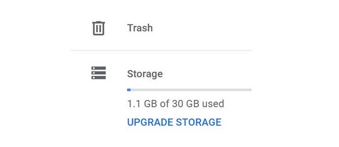
Think of a mobile phone without the indication of battery or a refrigerator that does not have the temperature status on. Around us, there are thousands of things that make sure to inform us about their status. For example, in Google Drive we see the following:
2. Make sure that there is relevance to the real world
However complex your niche is, try to find simple words to describe what you want to share. Apart from anything else, this is going to help you SEO-wise, since you will “respond” to your audience’s searches.
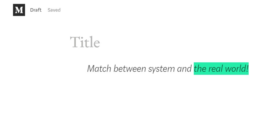
Besides words, it is equally important to use familiar images or concepts. A fine example is the standard shopping cart used by most eShops. The visitor looks at it and instantly knows what s/he can do (buy, remove or add items). As far as concepts are concerned, think of something that Medium offers as an option. An article writer is able to highlight a part of the text in vivid colors, just like s/he would in real paper!
3. Give the user freedom of movements
Grant the user of your website or app with freedom, so that they can easily correct any possible mistake! After all, no matter how perfect your system might be, mistakes can always happen. Create fire exits that a user may turn to, in cases of need. For example, s/he may not want to proceed with the recommended update or s/he may not have the time to complete a specific action. In addition, offer the options to “undo” and “redo”. They are very helpful and the user feels a greater sense of security, having complete control over his actions!
4. Say “yes” to popular practices, conventions, and consistency
Experimenting is good, but think of how weird it is going to look to the user if out of the blue s/he comes across a website with the logo implemented at the bottom, rather than the top! It is essential that you stick to the standards and let your creativity run wild, within a specific context. It is equally important to be consistent with your own standards. For example, keep the same buttons or the same environment for similar actions throughout your system.
5. Try to prevent any mistakes
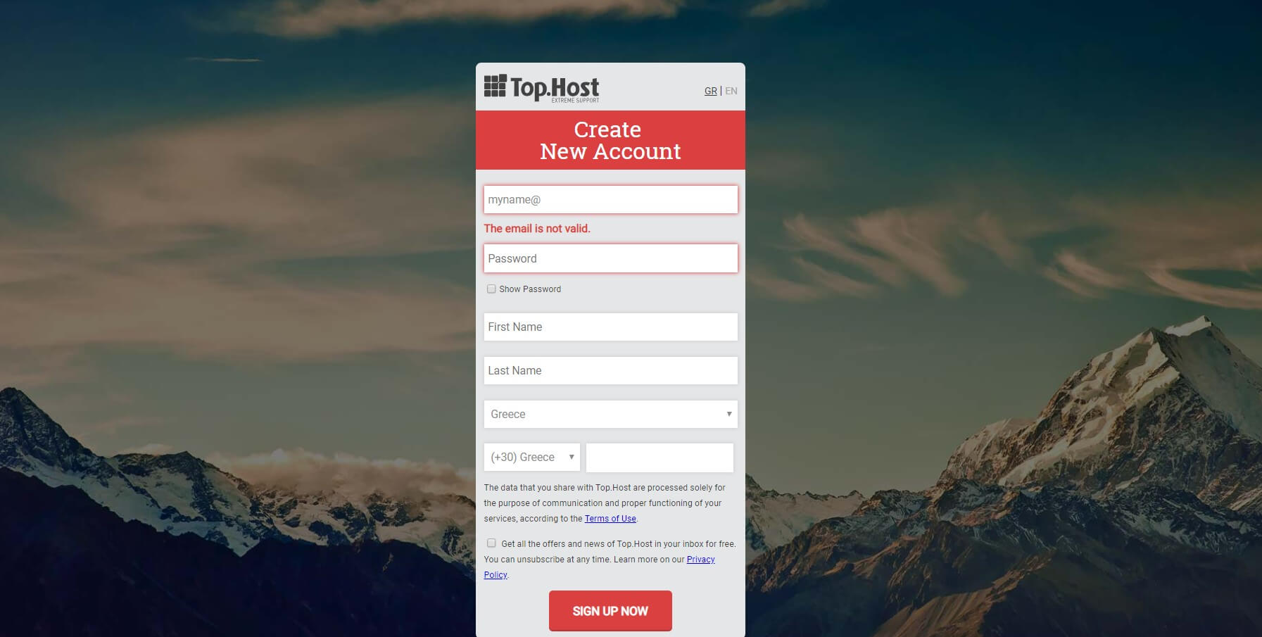
In many cases, you can help the user to avoid mistakes. Think of how many times you have misspelled a word in Google. Before even hitting enter, Google presents you with choices and alternatives below, so as to minimize the chance of ending up with results that do not fully correspond to your search. Or check at our example when an individual wishes to sign up for a new account at TopHost. As soon as s/he submits an email that does not have the proper format, a warning message appears. So, our visitor corrects the mistake before proceeding with the specific action.
6. Facilitate the memory of the user
“Where is this now?”. It is ideal for the user never to come to the point, where s/he expresses that very question. Boost his/her memory and offer ways to identify what s/he is searching for, rather than remembering that. If you own an eShop, you can simply do that by creating a list with the products s/he has looked at recently!
7. Help the user identify and correct any mistakes
Error signs are sure to appear at some point. Try to make them as comprehensible as possible, without containing any words or descriptions that can confuse people! Help the user identify what has gone wrong and see how s/he can correct any mistakes.
8. Say “no” to unnecessary information
It is best to keep the design aesthetically beautiful and minimalistic. The user environment should not be bombarded with information that is not useful to the user at that point, or with details that are rarely going to help him/her out. Every extra piece of information “competes” with the rest and as a result, the user may end up baffled, without spotting what s/he actually needs.

9. Offer flexibility
It is important that the users experience flexibility and are able to adjust their navigation to their very own needs! Bookmarks at Chrome and any other browser serve exactly the same purpose. They offer us flexibility. With a simple click of a button, we can reach the site we want to visit. Respectively, keyboard settings allow us to create our very own shortcuts. Find the way to provide such opportunities to your visitors!
10. Don’t forget about user instructions!
It would be ideal for the system to operate without the need of clarifications. A TV, for instance, can be installed without having to read through the entire manual. However, in some cases, the user requires assistance and it is good if you can provide that with ease. Offer information that can easily be searched and is specific. Share the specific steps to follow and do not get into unnecessary details.
We hope that the tips shared above have been useful to you. Maybe they can help you make your website or app unbeatable! Of course, you should always keep in mind that the UI must always go hand in hand with the UX. But we will get into that in due time, like we said!


Join the Discussion