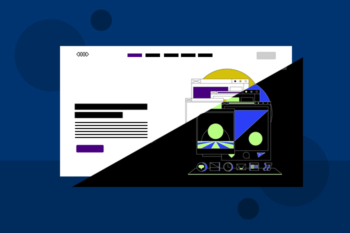
The dark mode is a visual interface design that has emerged as an increasingly popular feature in web design in recent years. This mode offers the users an alternative color scheme that replaces the traditional white background with a dark one. Its increasing popularity has brought about a growing practice by big companies and social media platforms like YouTube, Instagram, Facebook, and Twitter to implement the ‘Dark Mode’ option.
With its surging appeal, almost 80% of users prefer the dark mode over the light mode, making it more of a necessity than a mere appealing feature. Naturally, this has led website owners to wonder whether they should have a ‘Dark Mode’ option.
So, before you decide if your website needs dark mode, it is important to understand why it is an increasingly growing trend.
Why has the dark mode become popular?
The surge in its popularity can be attributed to its widespread adoption across various digital platforms and applications by major operating systems. The incorporation of built-in dark mode settings by iOS, Android, MacOS, and Windows has given users the flexibility to choose a visual option that is more appealing and less glaring. Providing them with a comfortable digital experience.
The rising trend can be mainly credited to the many advantages of the ‘Dark Mode’ features. The benefits of implementing dark mode on your website are:
Reduces strain on the eye
The post-pandemic years have brought about a positive increase in people becoming more conscious about their health and wellbeing. So, the main reason the dark mode feature is becoming widely used is because it significantly reduces stress on the user’s eyes. Especially in low-light conditions, dark mode minimizes the contrast between the screen and the surrounding area. With screen time rapidly growing daily, people adapt to the dark mode for a better user experience and low blue light exposure. Using this alternative color scheme may keep visitors to your website for a longer time.
Increases visibility in low-light setup
The dark mode can increase the user’s visibility comfort and improve visibility flow, especially in low-lit surroundings. This mode can make your website easier to explore at night time and make your website a pleasure for users to surf.
Battery Conservation
High battery consumption has always interrupted the user’s flow when browsing online. However, the usage of dark mode has been shown to improve the device’s battery consumption. Especially devices with OLED screens, such as many smartphones, as each pixel emits light. Displaying dark-colored light requires less power than illuminating the entire screen with bright colors.
Aesthetic Appeal
Dark colors have often been associated with providing a classy, rich, and sophisticated look. Similarly, the dark theme evokes a sleek and modern charisma that makes it appealing and desirable to users. The dark mode enhances the perceived contrast of the user interface and the overall feel of the screen, helping the website users feel more credible. It can particularly enhance the visual experience of users with visual impairments.
Focus on content
Dark mode greatly impacts what you want your user to focus on. The dark background enhances the visibility of the content, allowing texts and images to stand out more prominently. This improves readability and provides users with a more immersive experience.
While the dark theme provides numerous advantages, it is important to consider potential drawbacks. Despite its popularity, certain aspects may pose challenges, making it important for website owners to weigh both advantages and disadvantages. Let’s take a look at the potential disadvantages of implementing dark mode.
Disadvantages of Dark Mode
Limited accessibility
Dark mode may not be suitable for all users. Some users with visual impairment or particular eye conditions may find reading light-colored text on a dark background challenging. As a website owner, you may risk alienating users who are accustomed to white backgrounds.
Generates a sense of less space
A white background provides a sense that the screen is open and spacious. However, the dark mode creates a visual sense that there is much less space.
Low emotional connection
A dark background can hamper the emotional connection that users can have with various colors, thereby evoking an emotional disconnection between the user and the content. As a website owner, you should pay close attention to your target audience and input the theme for the website accordingly.
Compatibility challenges
Implementing dark mode will require additional coding and design. There may be challenges to ensure compatibility across different browsers and devices. This can lead to inconsistent user experience and disrupt the flow of the website.
Conclusion: Is Dark Mode right for your website?
Yes and no. While dark mode can be implemented on your website, the decision should be made with a thoughtful approach and a good understanding of your target audience. Finding the right balance, such as providing the users’ flexibility of choice, educating users, and providing proper features, can also benefit your website.
Nevertheless, you must prioritize your user’s preferences and seek expert help to ensure a successful user experience. Provide an array of features so that your website can cater to a broader audience while maintaining high visual appeal and functionality.


Join the Discussion